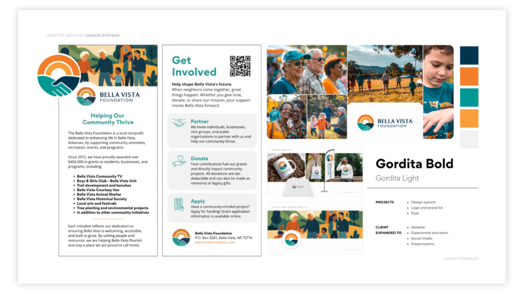
Bella Vista Foundation’s old brand didn’t say who they were or what they meant to their community. Laura worked directly with their committee to design a new mark that told that story at a glance – interlaced hands representing community coming together, set against the hills, rivers, and sunsets of the region itself.
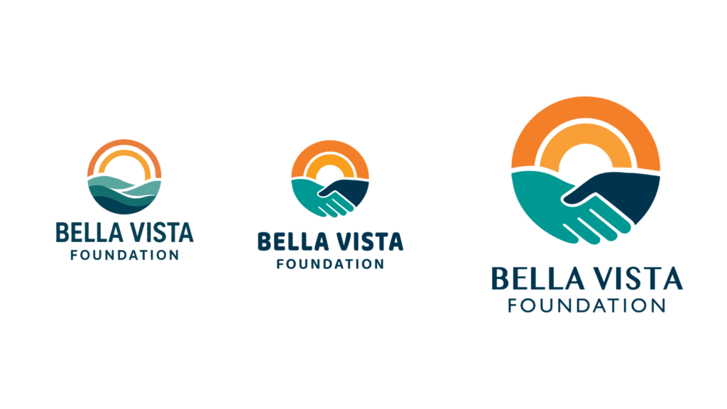
The minimalist design gave a historic, aging community a visual identity that welcomed the younger families now joining it, while staying rooted in the land and people that define the area. Laura then extended the new brand into a pamphlet that carried the story further, giving the Foundation a cohesive way to introduce itself to old and new neighbors alike. The system continues to power their website, presentations, and local events today.